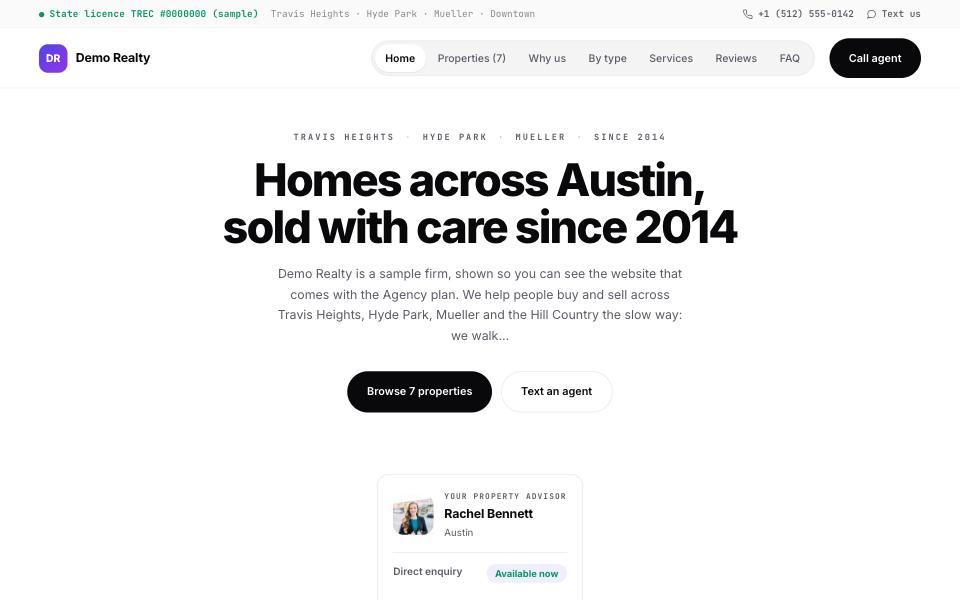
Vertex
LightA product page, not a brochure: indigo-to-violet, the nav collected into one pill, a centred opening and monospaced data labels.
Drawn for United States, Canada
Each one is a different page, not one layout in a new colour: a different opening, a different running order, its own type and its own buttons. Every design is drawn for the way property is marketed in a particular part of the world, and every one of them works anywhere. Tap Live demo to walk through a sample agency wearing it — every page, not a screenshot.
A product page, not a brochure: indigo-to-violet, the nav collected into one pill, a centred opening and monospaced data labels.
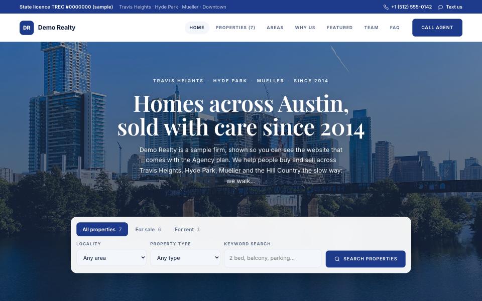
The American brokerage site: a full-width photograph with the search right in it, neighbourhoods as tiles, featured homes, the team, a client quote. Navy, white and a touch of sky.
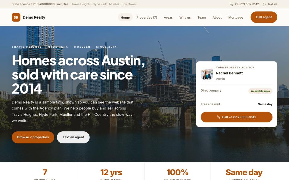
Warm earth tones and a friendly geometric face for a suburban family team: the areas you serve, the homes, then the people behind them and what a client said.
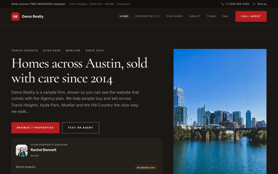
Charcoal and brick with a serif headline and a tall standing photograph. The urban luxury broker: one spotlight property, the folio, the team, no noise.
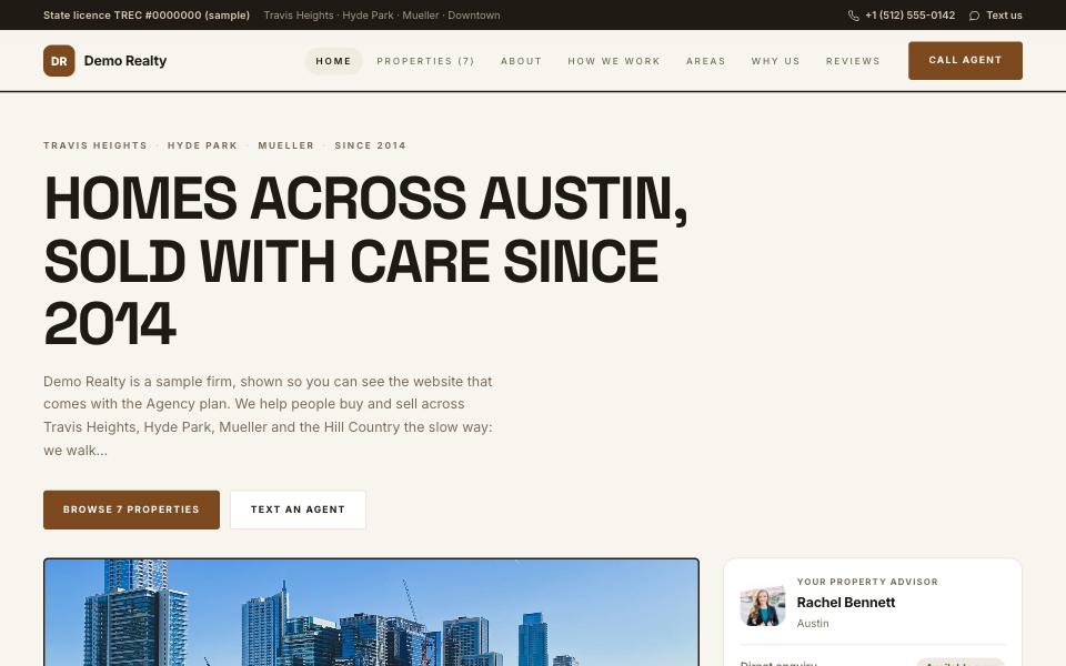
Cream, saddle brown and wide uppercase labels for land, acreage and country homes: the photograph framed beside the words, numbers in a band, the process spelled out.
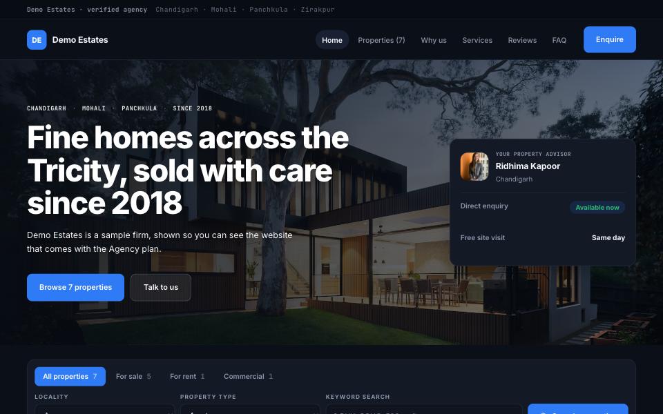
Near-black with electric blue and monospaced labels. The photographs carry the page — the design gets out of their way.
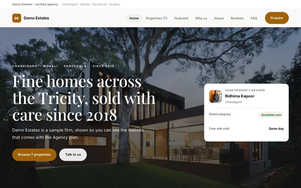
Warm paper, a Playfair headline and the editorial canvas — one property large beside a stack, the way a magazine opens.
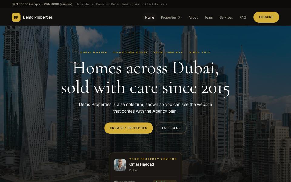
Near-black and gold with a Cormorant headline. Properties run as full-width folio strips rather than tiles — for a book that is short and expensive.
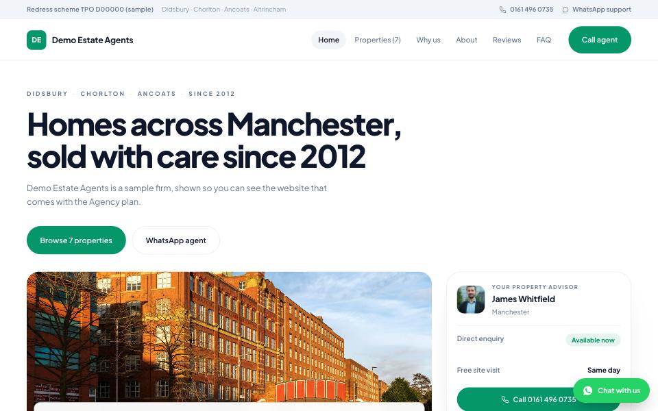
Pure white, generous type, soft corners and pill buttons. The photograph sits beside the headline rather than behind it.
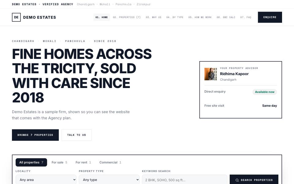
A drawing set: hard edges, no rounded corners, monospaced labels and a numbered nav. Built for plots, approvals and paperwork.
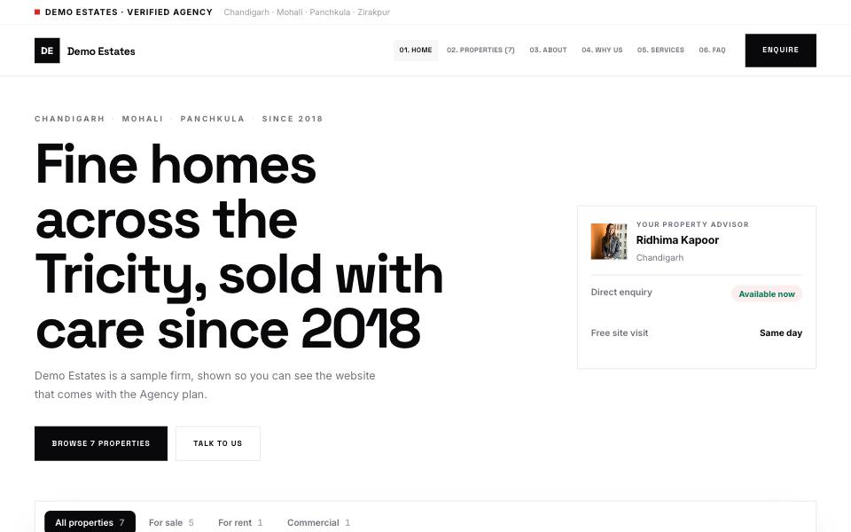
International typographic style — one red, square corners, numbered sections and a headline that fills the page.
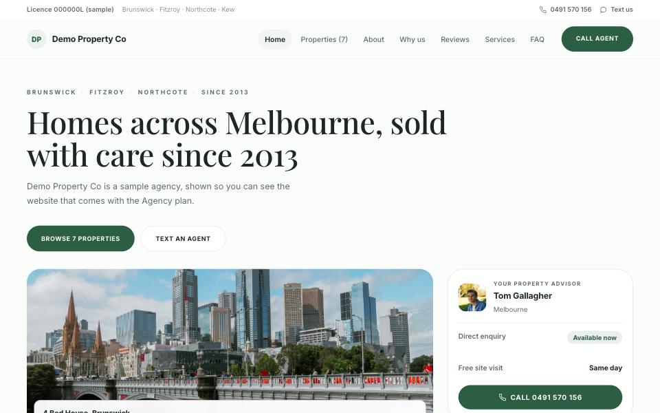
Off-white, forest green and a Playfair headline with fully round pills. The calmest of the eight — built for homes, not yield.
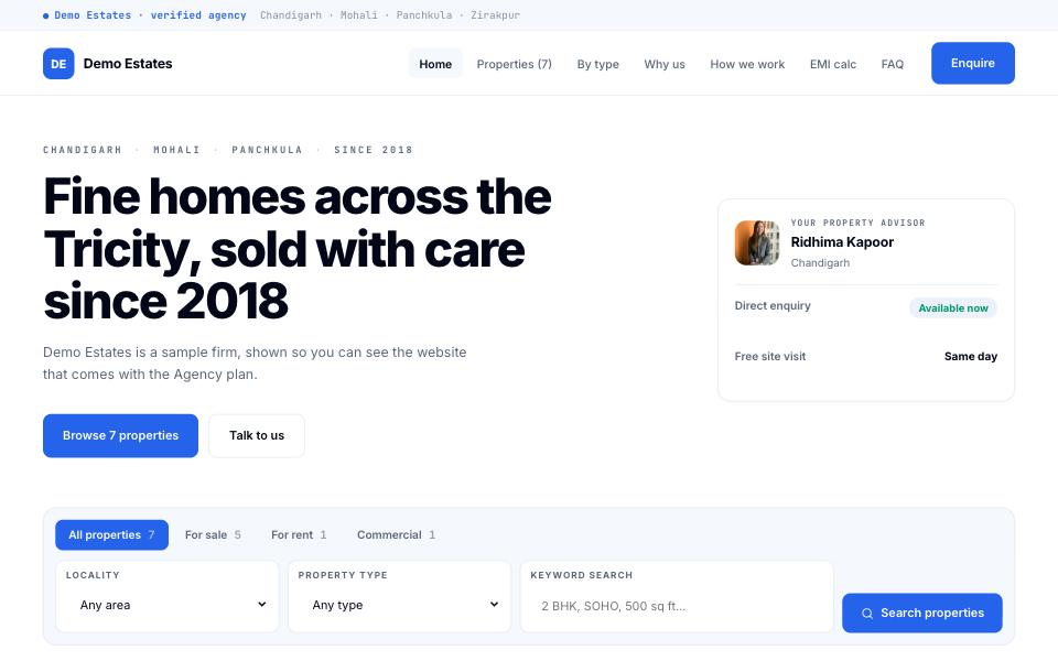
White with an electric blue and monospaced data labels. A console-styled filter bar and figures that read like a terminal — for the yield conversation.
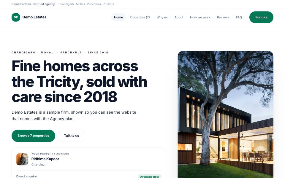
Scandinavian white with a forest emerald and a tall photograph standing beside the headline. Airy, unhurried, and it prints beautifully.
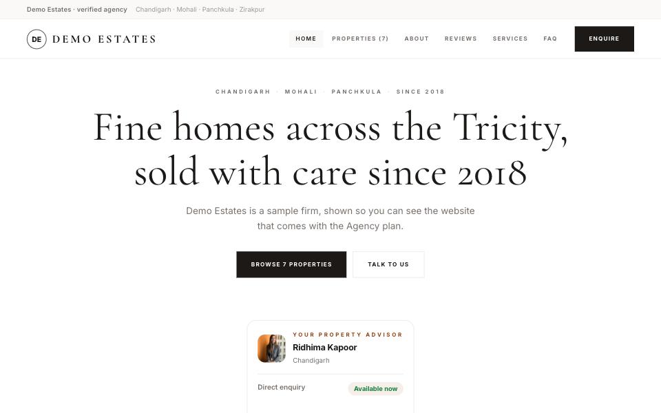
The atelier on paper — a centred Cormorant headline, amber figures and the folio running as full-width strips. Discreet and expensive-looking.
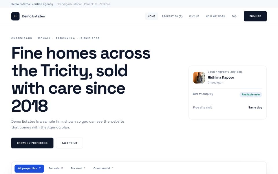
Space Grotesk throughout, near-black controls that turn blue on contact, and a modest radius. Quieter than Swiss, and built to be read fast.
A product page, not a brochure: indigo-to-violet, the nav collected into one pill, a centred opening and monospaced data labels.
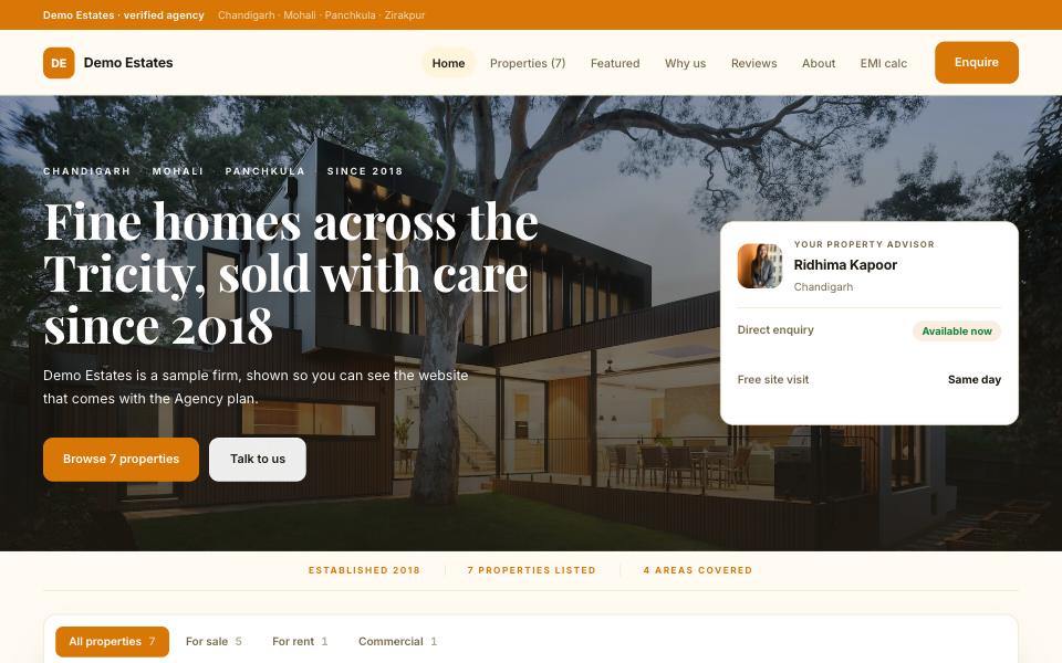
Saffron on ivory with a Playfair headline: warm, trusted, festive without shouting. The trust line and reviews come early, because that is what an Indian buyer checks first.
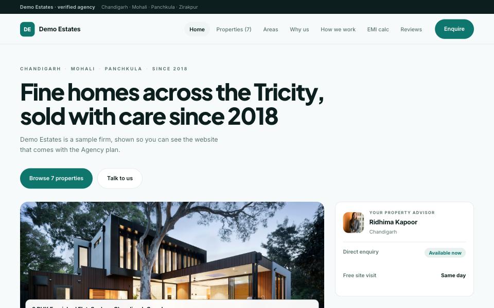
Deep teal and ivory, the photograph framed beside the words, and the areas you cover as tiles right under the opening — built for an agency whose name is known by locality.
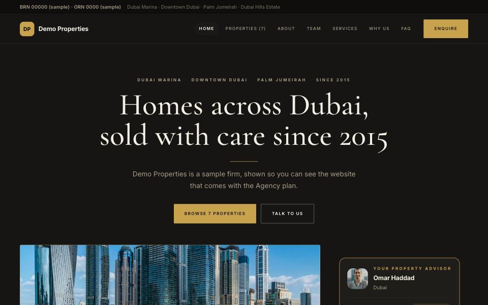
Charcoal and brushed gold, the Cormorant headline set centre on the dark ground itself with a gold rule under it. The quiet luxury of a Dubai brokerage: a spotlight property, the folio, the team up front.
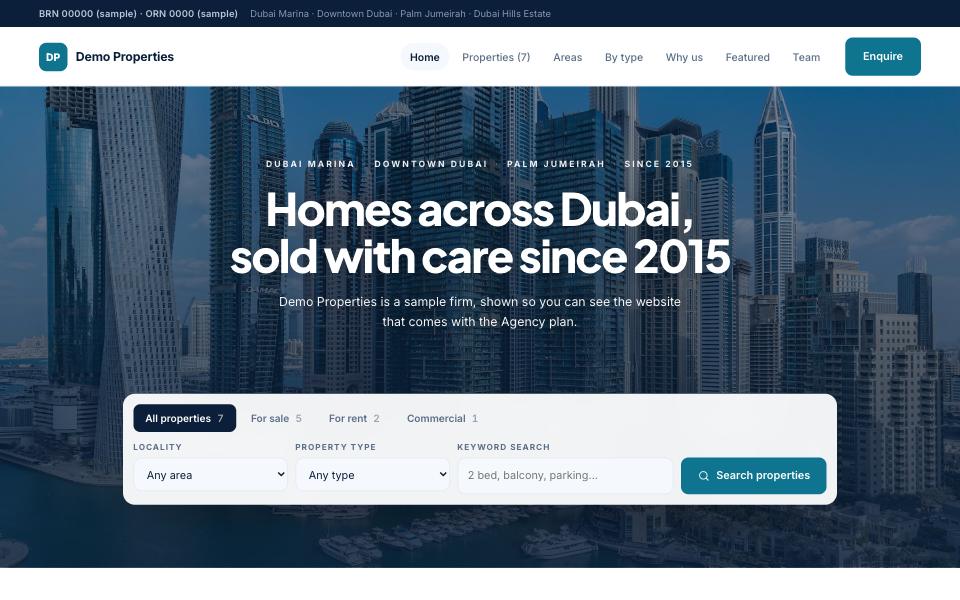
White, navy and a line of aqua, opening like a property portal: the search box inside the hero, the communities as tiles, the numbers next. For a brokerage that lives on Property Finder and wants a front door of its own.
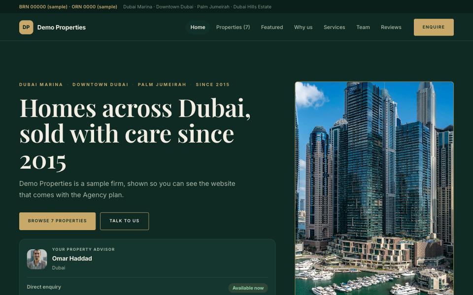
Deep emerald with brass and a tall photograph standing beside the headline. Formal and generous, with the advisor and the Fal licence where a Saudi buyer looks for them.
The American brokerage site: a full-width photograph with the search right in it, neighbourhoods as tiles, featured homes, the team, a client quote. Navy, white and a touch of sky.
Warm earth tones and a friendly geometric face for a suburban family team: the areas you serve, the homes, then the people behind them and what a client said.
Charcoal and brick with a serif headline and a tall standing photograph. The urban luxury broker: one spotlight property, the folio, the team, no noise.
Cream, saddle brown and wide uppercase labels for land, acreage and country homes: the photograph framed beside the words, numbers in a band, the process spelled out.
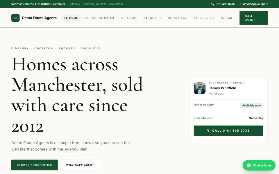
Off-white paper, racing green and a Cormorant headline with numbered sections. The established high-street agency: guide prices, a quiet confidence, the redress scheme in the footer where it belongs.
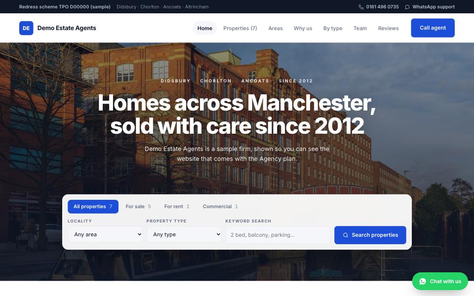
Slate blue and white in the portal register a British buyer already knows: search in the hero, the latest instructions, areas, then the team. Clean, fast, familiar.
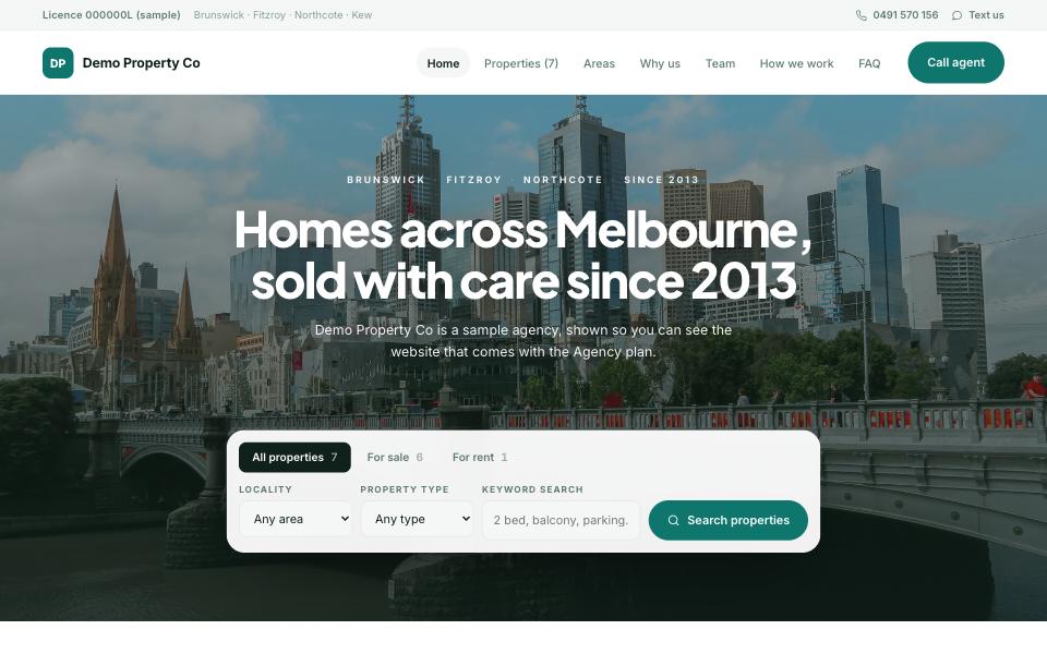
White, eucalyptus and sand, opening on the search over a wide photograph, then suburbs as tiles and a client quote over the water. The Australian agency page, where price guides and auctions are normal.
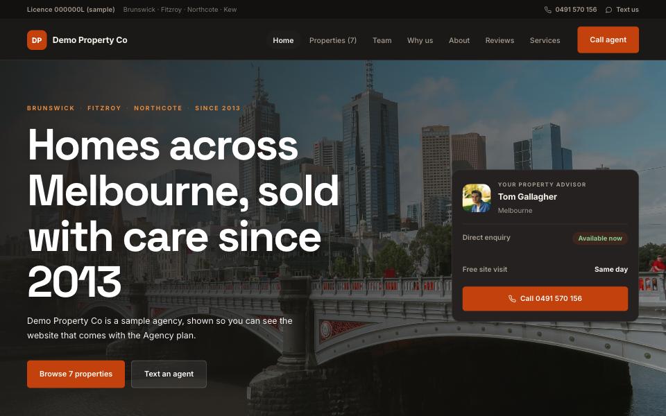
Terracotta on charcoal with a bold grotesque headline. Direct and sun-worn: the numbers first, the listings, the people, the process — for a regional agency that sells on reputation.
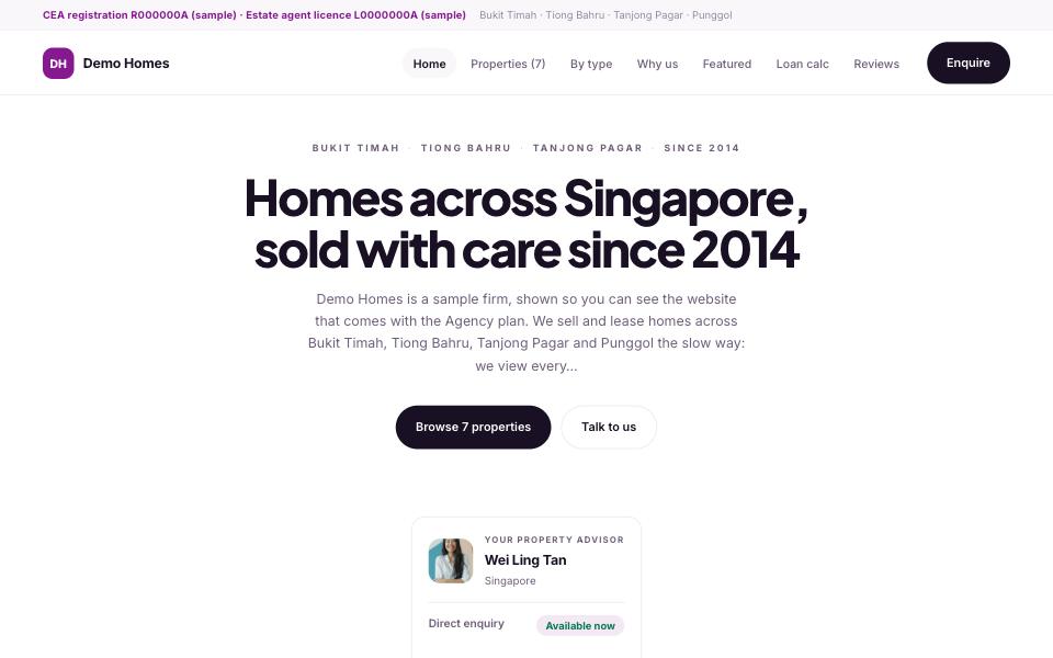
White with a plum accent and a centred, type-led opening. Precise and condo-minded: the search, the stats, the units, and the CEA registration on the top bar the way the rules ask.
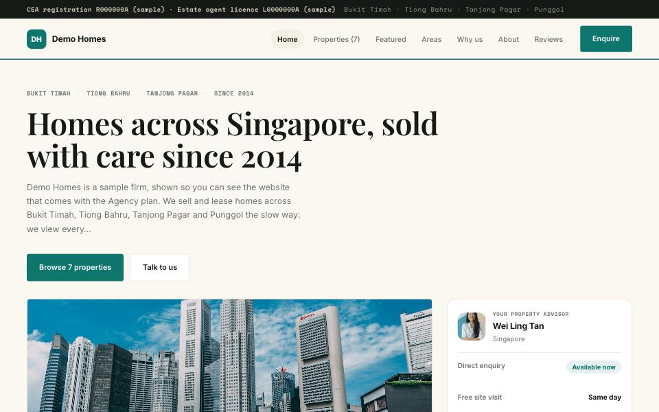
Cream, jade and a stroke of red with monospaced labels and the folio strip — photo left, detail right. Heritage-minded, for an agency that sells character property as much as units.
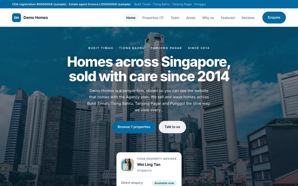
Ocean blue and white, centred over a wide photograph, with the areas as tiles and the agents close to the top — for markets where a buyer starts on Facebook and wants to see a face and a message button first.
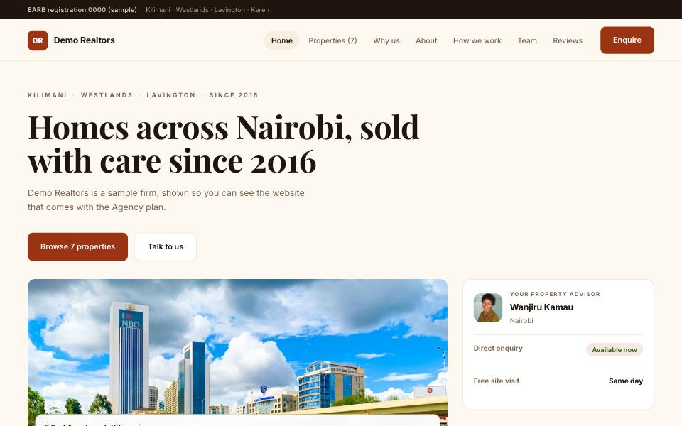
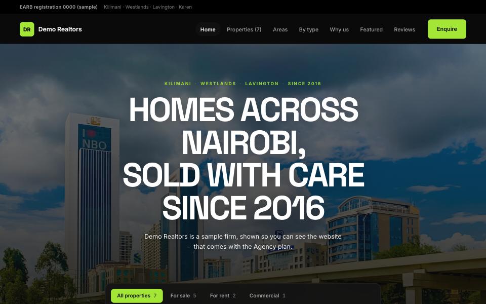
Black and lime with a bold grotesque and the search in the hero. Energetic and mobile-first: estates as tiles, the listings, the numbers, and WhatsApp everywhere a buyer would reach for it.
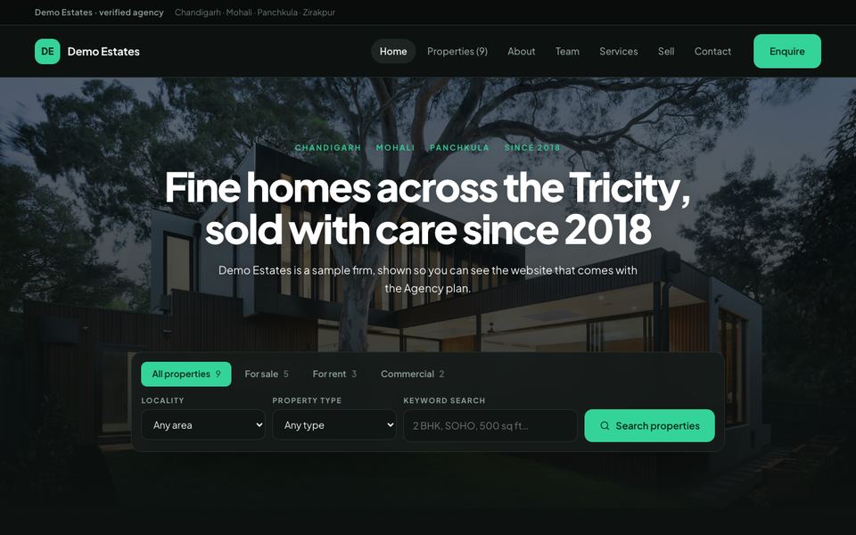
Charcoal and emerald with the search in the hero. One property large beside a stack, then the areas, the numbers and the reasons — a confident dark page that is not blue.
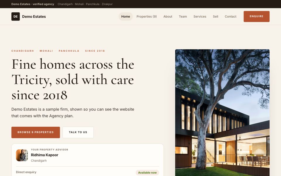
Warm linen and terracotta with a Cormorant headline and a tall photograph beside it. The firm’s story sits high on the page — for agencies that sell homes on trust.
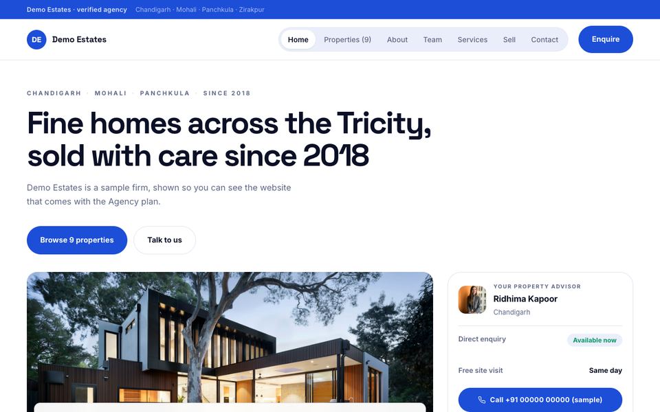
White with a single cobalt blue, Space Grotesk and a pill menu. The photograph sits beside the headline; what is new runs as a carousel. Clean and quick to read.
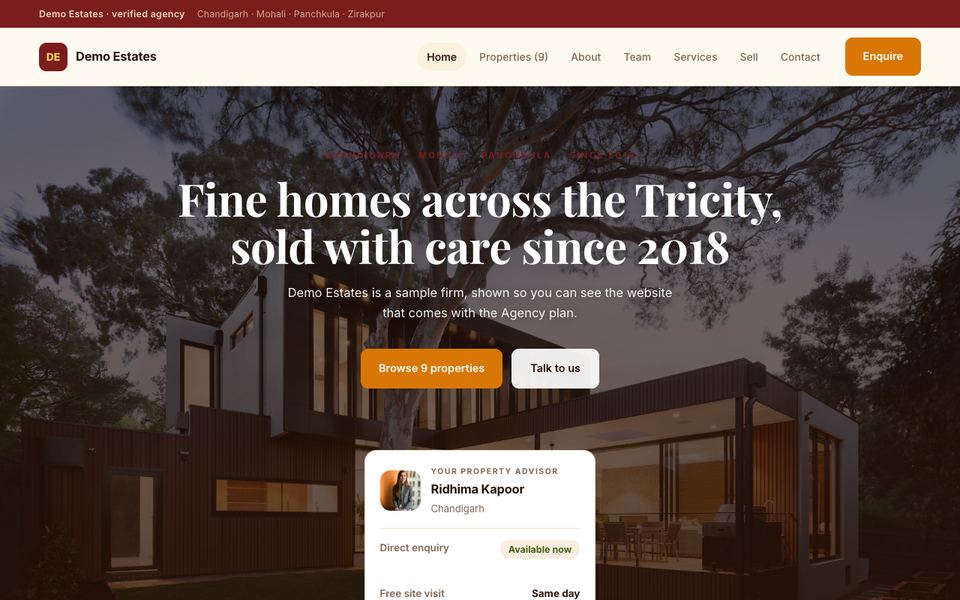
Cream, saffron and deep maroon with a Playfair headline centred over the photograph. Localities first, then the listings and the loan calculator — the order an Indian buyer asks in.
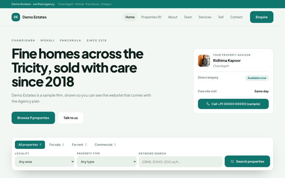
Pale sage with a deep jade green and a type-led opening. The properties run as full-width rows with the whole story beside each photograph — calm, and easy on the eye.
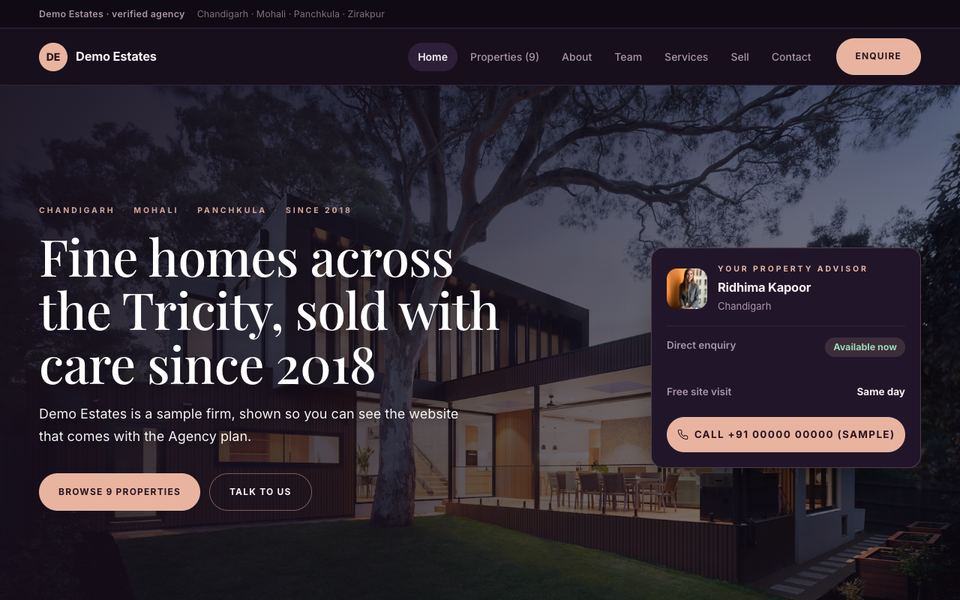
Deep plum and rose gold with a Playfair headline over the photograph. One residence large beside a stack, a quotation, the people — luxury without the usual black and gold.
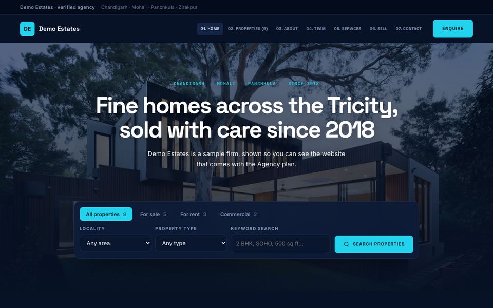
Midnight navy and cyan with Space Grotesk and a numbered menu. Property types, a carousel of launches, the numbers and the loan calculator — for towers, projects and investors.
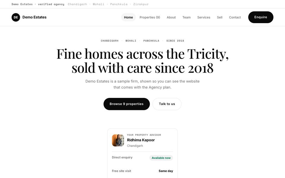
Black on white and nothing else. A centred headline, hairlines and monospaced labels, with the properties hung as full-width rows — the photographs supply all the colour.
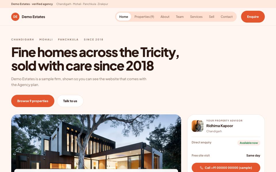
Soft peach and coral with fully rounded corners and a pill menu. Friendly and approachable — made for first homes, rentals and agencies that want to feel easy to call.
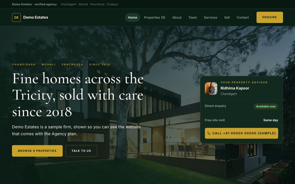
Deep bottle green and antique gold with a Cormorant headline over the photograph. An established family firm’s page: the story, the listings, the people, and the loan figures.
Your logo and colours, your team with their own pages, every property your team has published, area pages search engines pick up, a contact and sell-your-property form, reviews, and your own domain with HTTPS. Switch designs any time from the dashboard — your content stays where it is. See the Agency plan →